Title Design
In the title sequence of my film, the words will usually fade into the scene and fade out, about 3 or so seconds later. In other cases, some will be a part of the environment in a scene, such as on a sign, or on the ground (though still using the same font).
My current title for this film is Pen on the Pavement, but while i like it a lot right now, it could change later if i think of something better.
 ,
,
which seems to be perfect for the style I want to portray.
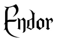
I plan to use a free font I found called
 ,
,which seems to be perfect for the style I want to portray.
I plan on making all of the words white, so it could contrast the settings of the movie, but if I find it too similar to where it doesn't stand out, I'll probably change it up a bit.
I plan to make the name of the person being mentioned in the sequence a couple sizes bigger that their title/role.


Comments
Post a Comment